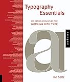
Typography essentials : 100 design principles for working with type / Ina Saltz.
Material type: TextPublication details: Beverly, Mass. : Rockport, c2009Description: 208 p. : ill. (some col.) ; 26 cmISBN:
 - 9781592537402
- 1592537405
- 686.224 SAL
| Item type | Current library | Collection | Call number | Copy number | Status | Date due | Barcode | |
|---|---|---|---|---|---|---|---|---|
 Books
Books
|
HCUC LIBRARY - ENGLISH COLLECTION Open Shelf | Non-fiction | 686.224 SAL (Browse shelf(Opens below)) | 1 | Available | 06242 |
Browsing HCUC LIBRARY - ENGLISH COLLECTION shelves, Shelving location: Open Shelf, Collection: Non-fiction Close shelf browser (Hides shelf browser)

|

|

|

|

|

|

|
||
| 686.224 HEL New ornamental type : decorative lettering in the digital age / | 686.224 HEL/C1 Typeplay / | 686.224 KOR GRAPHIC DESIGN COOKBOOK | 686.224 SAL Typography essentials : 100 design principles for working with type / | 686.224 SPI Stop stealing sheep & find out how type works / | 686.2252 CYR Brochure design that works : secrets for successful brochure design / | 686.2252 HAR The newspaper designer's handbook / |
Includes bibliographical references and index.
Table of Contents
Introduction 6 (2)
THE LETTER
1 Using letter as form 8 (2)
2 Using counter spaces as form 10 (2)
3 Letterform details 12 (2)
4 Emotional content implied by the text 14 (2)
5 Historical connotation 16 (2)
6 Considering the medium 18 (2)
7 Honoring dignity 20 (2)
8 The handmade solution 22 (2)
9 Being expressive 24 (2)
10 Staying neutral 26 (2)
11 Considering background contrast 28 (2)
12 Emphasis using weight 30 (2)
13 Emphasis using contrasting weights 32 (2)
14 Emphasis using size 34 (2)
15 Emphasis using contrasting sizes 36 (2)
16 Proper smart quotes 38 (2)
17 The hyphen, the en dash, and the em dash 40 (2)
18 High contrast in reverse 42 (2)
19 Extreme scaling 44 (2)
20 Heavy flourishes 46 (2)
21 Thinking like a typesetter 48 (2)
22 Using display versions 50 (2)
23 Using numbers 52 (2)
24 Dingbats and pictograms 54 (2)
25 Theory of Relativity I 56 (2)
THE WORD
26 A "bad" typeface? 58 (2)
27 Typographic abominations 60 (2)
28 Hierarchy using position 62 (2)
29 Hierarchy using size 64 (2)
30 Hierarchy using weight 66 (2)
31 Hierarchy using color 68 (2)
32 Hierarchy using contrast 70 (2)
33 Hierarchy using orientation 72 (2)
34 Hierarchy using special effects 74 (2)
35 To kern or not to kern 76 (2)
36 Type as image 78 (2)
37 Three-dimensional type 80 (2)
38 Repetition 82 (2)
39 Deconstructed type 84 (2)
40 Vertical stacking 86 (2)
41 See the shape 88 (2)
42 Using cases 90 (2)
43 The rule of three typefaces 92 (2)
44 Mixing many typefaces 94 (2)
45 Mixing type using contrast, weight, or 96 (2)
color
46 Mixing typefaces using historical 98 (2)
compatibility
47 Familiarity breeds legibility 100(2)
48 Properly weighted small caps and 102(2)
fractions
49 Using the right type 104(2)
50 Theory of Relativity II 106(2)
THE PARAGRAPH
51 Invisible typography 108(2)
52 Highly evident typography 110(2)
53 Less is more 112(2)
54 More is more 114(2)
55 Letter spacing and word spacing 116(2)
56 Hyphenation and justification 118(2)
57 Tracking guidelines 120(2)
58 The "color" of the text type 122(2)
59 Considering typographic mass 124(2)
60 Pattern, gradation, and texture 126(2)
61 Basic leading principles 128(2)
62 Optimum line lengths 130(2)
63 Increasing leading 132(2)
64 Tightly stacked lines 134(2)
65 Indicating paragraphs 136(2)
66 Initial caps and drop caps 138(2)
67 Opening paragraphs 140(2)
68 Orphans and widows 142(2)
69 "Rivers" of space 144(2)
70 Eschew decorative type 146(2)
71 Celebrate decorative type 148(2)
72 Text overlapping images 150(2)
73 Text overlapping text 152(2)
74 The text block effect 154(2)
75 Theory of Relativity III 156(2)
THE PAGE
76 Legibility, legibility, legibility 158(2)
77 Legibility taking a back seat 160(2)
78 Limiting typefaces 162(2)
79 One type family 164(2)
80 Six necessary typefaces 166(2)
81 A need for every typeface 168(2)
82 Text typefaces versus display typefaces 170(2)
83 Organized entry points 172(2)
84 Systematizing hierarchy 174(2)
85 Using justified type 176(2)
86 Using flush-left, rag-right type 178(2)
87 Using centered, asymmetrical, and 180(2)
flush-right type
88 The multicolumn text grid 182(2)
89 The uneven text grid 184(2)
90 Typographic "furniture" 186(2)
91 Decks, callouts, and pull quotes 188(2)
92 The "birth and death" of the text 190(2)
93 Chaos versus order 192(2)
94 Commentary, marginalia, and alternate 194(2)
languages
95 Tables and charts 196(2)
96 Navigational devices 198(2)
97 Margins and gutters 200(1)
98 Framing the text 201(1)
99 Floating in space 202(2)
100 Theory of Relativity IV 204(2)
Contributors Index 206(2)
About The Author 208(1)
Acknowledgments 208
There are no comments on this title.

